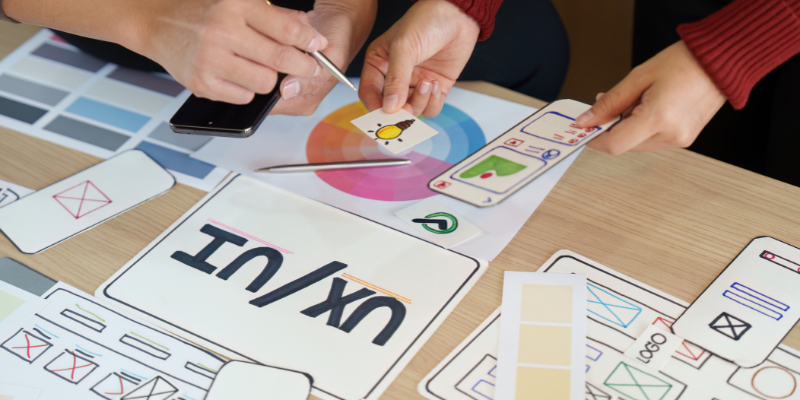
Digital products live or die by their interface.
But what is UI design exactly? User Interface (UI) design refers to the process of designing the visual elements of an application or website that users interact with.
It includes everything from buttons and icons to menus, layouts, and colors. UI design ensures that the interface is intuitive, visually appealing, and easy for users to navigate, providing a seamless experience.
It goes hand-in-hand with user experience (UX) design but focuses more on the aesthetics and interactivity rather than the overall usability.
With the increasing reliance on digital devices, UI design is more important than ever for ensuring products are both functional and visually engaging.
In this blog, we will explore what UI design is, its key elements, and how it contributes to creating effective and user-friendly digital experiences.
What is UI Design?
UI design (user interface design) involves designing the visual and interactive elements of a digital product, everything the user sees and interacts with on the screen, while working closely alongside UX design to ensure the interface aligns with user needs and expectations. UI designers consider layout, colours, typography, icons, buttons, animations, and micro‑interactions to create coherent interfaces that guide users through a product.
UI vs. UX
UI and UX (user experience) design are related but distinct disciplines:
- UX design focuses on the overall experience, addressing user needs, information architecture, workflows, and satisfaction.
- UI design focuses on the look and feel – the visual presentation and interactions that bring the UX to life.
In practice, the two disciplines are tightly linked. A delightful UI makes a well‑researched UX more usable; conversely, great UX strategy ensures the UI addresses real user problems. This relationship is often evaluated through a UI UX audit, which helps identify usability gaps and visual inconsistencies.
The Role of UI Design in Digital Experience
UI design shapes how people perceive and interact with a product. A purposeful interface:
- Ensures intuitive navigation: Users find what they need quickly, reducing cognitive load. Micro‑commitment flows, such as asking a small question before a big ask, can increase conversions.
- Enhances brand identity: Colours, typography, and imagery communicate the brand’s personality and values.
- Boosts engagement: Visually attractive, interactive interfaces encourage users to explore and stay longer.
- Improves usability: Thoughtful placement of buttons and clear feedback reduce user frustration, which is crucial because users leave a competitor after a bad mobile experience.
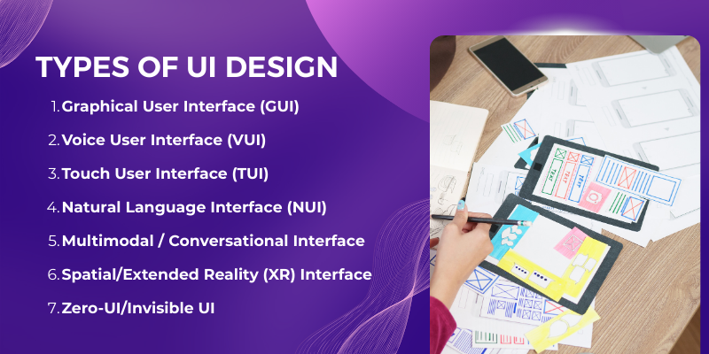
7 Types of UI Design
Different interfaces are suited to different contexts.
|
Type of UI |
Key Features |
Example Uses |
|
Graphical User Interface (GUI) |
Visual elements like windows, icons, buttons, menus; usually navigated by mouse or touch. |
Desktop and mobile apps, websites. |
|
Voice User Interface (VUI) |
Voice commands; conversational interactions using speech recognition. |
Virtual assistants (e.g., Siri, Alexa), voice ordering systems. |
|
Touch User Interface (TUI) |
Interactions via touch gestures (tap, swipe, pinch); intuitive for smartphones and tablets. |
Mobile apps, kiosks, tablets. |
|
Natural Language Interface (NUI) |
Allows users to communicate with the system in natural language (voice or text). |
Chatbots, AI‑powered assistants. |
|
Multimodal / Conversational Interface |
Combines voice, text, gesture and graphical controls; adapts to context. |
Smart home devices, cars, AR/VR. |
|
Spatial/Extended Reality (XR) Interface |
3D interfaces in AR/VR environments; uses gaze, motion and spatial audio. |
Augmented reality headsets (e.g., Apple Vision Pro), VR apps. |
|
Zero‑UI/Invisible UI |
Interfaces with minimal or no on‑screen elements, relying on sensors and automation. |
Wearable devices, smart rings, ambient computing. |
6 Key Elements of UI Design
A high‑quality interface integrates several elements:
- Visual design: Colours, typography, and imagery set the tone and reinforce branding. Thoughtful use of colour and contrast improves readability and accessibility.
- Layout and structure: Organises content so users can scan and navigate effortlessly. The rise of bento‑grid layouts (multiple banners on one screen) is replacing the low‑performing carousel because only about 1 % of visitors click carousel slides.
- Buttons, icons, and controls: Provide clear actions. Micro‑interactions (e.g., button animations) add feedback and delight.
- Typography: Font choices affect readability and tone. Designers are adopting larger, softer type and increased spacing to improve accessibility.
- Images, illustrations, and videos: Visuals aid storytelling and can increase engagement when combined with text (e.g., text overlaying images in hero sections).
- Feedback and states: Visual cues (hover effects, success/error messages) inform users about the result of their actions.
Read More: How to Design a Logo
UI Design Trends for 2026
The digital design landscape evolves rapidly. Based on leading blogs and research, here are the key UI trends shaping 2026:
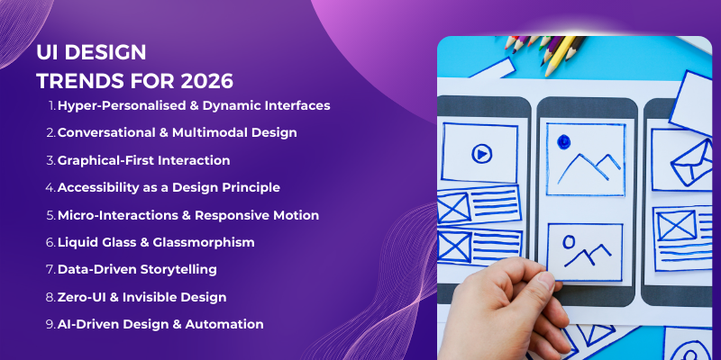
1. Hyper‑Personalised and Dynamic Interfaces
Generative AI enables interfaces that adapt layout, content and features to individual users in real time. Also, dynamic, personalised interfaces shift away from a one‑size‑fits‑all layout, presenting only the elements relevant to a user’s intent.
Moreover, Deloitte research adds that personalisation can deliver a 10–15 % revenue lift.

2. Conversational and Multimodal Design
Voice, chat, gestures and text inputs are converging. Multimodal interfaces let users speak when voice is natural, type when precision is needed, and use visual controls for speed.
Deloitte reports that 45 % of customers use voice features on their smartphones, and voice UI is becoming mainstream in apps like Starbucks’s voice ordering.
3. Graphical‑First Interaction
While voice is growing, many users still prefer direct manipulation. Gesture‑based navigation (e.g., swiping and dragging in Spotify) provides immediate, intuitive control. Graphical‑first design reduces misinterpretation and makes interfaces feel more responsive.
4. Accessibility as a Design Principle
Inclusive design is no longer optional. Accessibility guidelines (e.g., WCAG 2.1) ensure people with diverse abilities can use digital products.
Microsoft Teams, for example, integrates live captions, high‑contrast modes and full keyboard navigation without compromising aesthetics. Products adopt larger type, softer edges and increased spacing to improve readability.
5. Alive Interfaces: Micro‑Interactions and Responsive Motion
Micro‑interactions add delight and feedback, confirming actions or drawing attention to important elements.
Google’s Material Expressive emphasises dynamic motion, textures and tactile feedback. These details make interfaces feel “alive” without overwhelming users.
6. Liquid Glass & Glassmorphism
Inspired by Apple’s 2025 redesign, glassmorphism reintroduces translucency, depth and motion.
Semi‑transparent layers and blurred backgrounds create light, floating cards that guide attention. Designers should consider contrast and readability to avoid accessibility issues.
7. Data‑Driven Storytelling
Static dashboards are giving way to interactive narratives. Animated “scrollytelling” guides users through insights, helping them understand complex data at a glance. Motion and storytelling can increase engagement and comprehension.
8. Zero‑UI and Invisible Design
Zero‑UI focuses on ambient interactions, voice and automation. Wearables like smart rings and ambient devices reduce on‑screen clutter. Designers must simplify interactions while ensuring users feel in control.
9. AI‑Driven Design & Automation
AI is becoming integral to the design process. Tools like Figma’s AI features, Galileo and Magician generate layouts, copy and code snippets, speeding up prototyping. AI also powers accessibility checks and personalised experiences.
These trends depend heavily on advanced creative services to balance motion with usability.
5 Best Practices for UI Design in 2026
When designing an effective UI, there are several best practices to follow.
- Consistency and simplicity: Use consistent colours, fonts and component patterns to reduce cognitive load. Strive for clear hierarchy and minimal clutter.
- Accessibility: Follow WCAG guidelines; provide high contrast, keyboard navigation and screen‑reader support. Designing for neurodiversity and different abilities expands your user base.
- Mobile‑first: With most of the traffic coming from mobile devices, design for small screens first. Prioritise content, simplify navigation and enlarge touch targets.
- Micro‑interactions: Incorporate subtle animations and haptics to provide feedback and delight. These details build trust and clarity.
- AI‑assisted workflows: Leverage generative design tools to experiment with layouts and speed up iteration. Use AI for personalised content and to enhance accessibility checks.
Popular UI Design Tools
UI designers use a variety of tools to ideate, prototype and collaborate. Here are widely used options and their strengths:
|
Tool |
Purpose |
Notable Features |
|
Figma |
Design & prototyping |
Cloud‑based, real‑time collaboration, design systems, and AI-powered suggestions. |
|
Sketch |
Vector‑based design |
Strong plugin ecosystem; widely used for macOS. |
|
Adobe XD |
Design & prototyping |
Integration with Adobe Creative Cloud; coediting. |
|
InVision |
Prototyping & feedback |
Interactive prototypes and design handoff. |
|
Axure RP |
High‑fidelity wireframing |
Complex interactions, conditional logic and documentation. |
|
Balsamiq |
Low‑fidelity wireframes |
Sketchy style for rapid ideation. |
|
Galileo / Magician (AI) |
AI‑powered design assistance |
Generate layouts, content and code; accelerate prototyping. |
Conclusion
Now that you understand what UI design is and why it’s crucial, let’s summarize the key points. UI design in 2026 is more than choosing colours and fonts, it’s about creating human‑centred, adaptive experiences that balance aesthetics, usability and business outcomes. With rising user expectations, mobile dominance and AI-powered personalisation, businesses that invest in thoughtful UI design, often with strategic guidance from experts like Centric, a digital marketing agency, will see tangible returns: higher conversion rates, increased loyalty and stronger brand differentiation.
By embracing trends such as hyper‑personalisation, multimodal interfaces, accessibility, spatial design and ethical practices, designers can craft interfaces that feel alive, intuitive and responsible. Combining these principles with data‑driven decision‑making and AI‑assisted workflows equips teams to build digital products that delight users and drive sustained growth.