Wondering how to design a logo? Let’s dive in and explore the process.
Designing a logo is a crucial step in building your brand identity. A logo is more than just a symbol; it’s a visual representation of your brand’s values, mission, and personality.
Whether you're a startup or an established company, your logo will play a vital role in how customers perceive your business.
A well-designed logo can create a lasting impression, establish trust, and differentiate your brand from competitors.
The process of designing a logo involves various steps, from defining your brand identity to choosing colors, fonts, and shapes that align with your business.
It’s essential to approach logo design with careful consideration, ensuring that every element communicates your brand's essence effectively.
The goal is to create a logo that is not only visually appealing but also versatile, scalable, and memorable.
In this guide, we’ll walk you through the key steps involved in designing a logo from seeking inspiration and brainstorming ideas to refining the final design.
By following these steps, you’ll be able to create a logo that resonates with your target audience, enhances your brand recognition, and stands the test of time. So, let’s dive into how to design a logo that will leave a lasting impression on your audience.
What is a Logo?
A logo is a graphic symbol or design that represents your brand, helping to communicate your business's identity in a clear and memorable way.
It serves as the visual cornerstone of your brand, encapsulating its essence, values, and personality in a simple, recognizable form.
A well-crafted logo creates instant recognition and builds trust with your audience, making it a crucial element of your brand's overall brand marketing strategy.
What Makes a Good Logo?
A good logo is a powerful visual tool that effectively represents your brand. To ensure your logo is impactful, it should possess the following key characteristics:
-
Uniqueness: A logo should be distinctive, setting your brand apart from competitors.
-
Memorability: It should be easy to recall, leaving a lasting impression on your audience.
-
Simplicity: A clean, straightforward design helps maintain clarity and avoids overcomplication.
-
Versatility: The logo should work well across various mediums and applications, from digital to print.
-
Alignment with Brand Identity: A good logo reflects your brand's mission, values, and personality.
-
Scalability: It must remain legible and visually appealing whether it's displayed on a business card or a billboard.
- Functionality: It should look good in black and white as well as color, ensuring it works in all settings.
Your logo is an essential component of branding in business, representing your business in a way that resonates with your target audience and conveys your values.
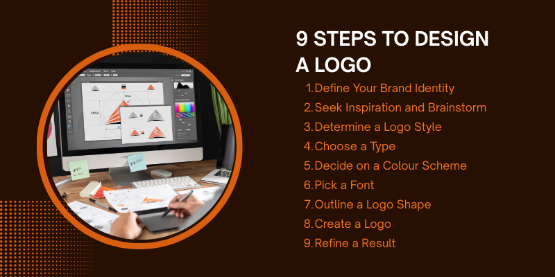
9 Steps to Design a Logo
Designing a logo involves a thoughtful process of creativity and strategy. It requires aligning your design with your brand's identity while ensuring it resonates with your target audience.

By following these essential steps, you can create a logo that reflects your brand's values and leaves a lasting impression.
1. Define Your Brand Identity
Understanding your business’s mission, values, and target audience is the foundation of logo design.
Your logo should serve as a visual representation of these elements, clearly reflecting what your brand stands for.
By defining your brand identity, you ensure that the design resonates with your audience and effectively communicates the essence of your business.
Key considerations include:
-
Mission: What is the purpose of your business? What problem does it solve?
-
Values: What principles guide your business? These can include sustainability, innovation, trust, etc.
-
Target Audience: Who are you designing for? What appeals to their needs and preferences?
A strong brand identity will help create a logo that is not only aesthetically pleasing but also meaningful and aligned with your business goals.
A great creative services can help refine this identity and transform it into a memorable logo that resonates with your audience.
Design your Logo with Our Creative Services
2. Seek Inspiration and Brainstorm
Gathering inspiration is a crucial step in the logo design process. By exploring various sources, you can spark creativity and generate ideas that reflect your brand identity.
Look into:
-
Industry Trends: Research logos within your industry to understand common design practices and avoid clichés.
-
Nature: Find inspiration in organic shapes, colors, and patterns that can bring a unique, natural feel to your logo
-
Art and Design: Explore different artistic styles, such as minimalism, vintage, or modern design, to influence your logo’s overall aesthetic.
Creating mood boards is a great way to visualize potential concepts and combine elements that inspire you. These boards can include color schemes, textures, typography, and imagery that align with your brand’s personality, helping guide your design direction.
3. Determine Logo Style
Choosing the right logo style is essential to ensure that your logo effectively represents your brand. The style should reflect your brand's character and appeal to your target audience.
Consider the following options:
-
Minimalist: Focuses on simplicity and clean lines, ideal for modern and professional brands.
-
Vintage: Evokes nostalgia and craftsmanship, perfect for brands with a classic or heritage feel.
-
Abstract: Uses geometric shapes or unique symbols, suitable for creative or innovative brands that want to stand out.
Ensure the chosen style aligns with your brand’s values, mission, and the emotional response you want to evoke in your audience. A professional design service can assist in selecting the perfect style, ensuring it resonates with your brand’s essence while remaining unique and timeless. The logo style should also resonate with your industry and market trends to maintain relevance.
4. Choose a Type
When designing a logo, decide whether it will be text-based, symbol-based, or a combination of both.
Each type has its own advantages:
-
Text-Based (Wordmark or Lettermark): This style focuses on typography. A wordmark uses the full name of your brand (e.g., Google), while a lettermark uses initials or abbreviations (e.g., IBM). It’s ideal for businesses with unique names or those looking to establish strong name recognition.
-
Symbol-Based (Icon): A symbol or icon represents your brand with a graphic element (e.g., Apple’s apple). It works well for brands aiming for a more visual and universal identity, especially those with shorter names or a global audience.
-
Combination of Both: This approach blends text and a symbol, offering flexibility. It allows your logo to work across various media, from digital design to print, while providing both visual and textual brand recognition (e.g., Adidas).
Choose the type that best conveys your brand’s identity and message, considering both current and future brand needs.
5. Decide on a Color Scheme
Selecting the right color palette is a critical step in logo design, as colors evoke emotions and influence perceptions.
The colors you choose should reflect your brand's personality and the message you want to communicate.
Consider these points:
-
Brand Personality: Different colors convey different traits. For example, blue often represents trust and professionalism, while red can evoke energy and passion.
-
Emotional Impact: Choose colors that align with the emotions you want to evoke in your audience. For example, green can symbolize health and nature, while yellow can evoke optimism and warmth.
-
Simplicity and Cohesion: Use a limited color palette to maintain simplicity and ensure the logo is easy to recognize. A cohesive color scheme helps your logo stand out and remain memorable across various platforms.
Make sure the colors are versatile and will work well across different media—whether it’s digital, print, or merchandise.
6. Pick a Font
Selecting the right font is crucial for your logo’s legibility and alignment with your brand’s identity. The font you choose should reflect your brand's personality while maintaining readability.
Consider the following:
-
Legibility: Choose a font that is easy to read at all sizes, from business cards to billboards
-
Brand-Appropriateness: The font should match your brand's tone. For example, a modern sans-serif may work well for a tech company, while a classic serif font might suit a luxury brand.
-
Avoid Overused Fonts: Steer clear of generic fonts that are commonly used. A unique font helps your brand stand out and ensures your logo is memorable.
-
Consistency: Ensure the font works well with the overall design, including your logo's color scheme and style.
7. Outline a Logo Shape
The shape of your logo plays a significant role in its effectiveness and versatility. When deciding on the shape, keep the following considerations in mind:
-
Circular: Often associated with unity, wholeness, and community. Circular logos can be very adaptable and work well in various formats, like social media profiles and app icons.
-
Square: Conveys stability, balance, and professionalism. Square logos often fit well into digital spaces and are easily scalable, making them ideal for branding materials.
-
Abstract: Its shapes can help create a unique and memorable identity. They allow for more creativity, enabling you to represent your brand’s values or mission through symbolic design.
-
Versatility: Ensure the logo shape works across different platforms and sizes. It should be recognizable on everything from business cards to large signage, while maintaining its visual impact and legibility.
Choose a shape that complements your brand’s message and ensures functionality across both digital and offline print design media.
8. Create a Logo
Once you have a clear vision of your brand identity, style, and elements, it's time to bring your logo to life using design software.
Here’s how to proceed:
-
Use Design Software: Utilize tools like Adobe Illustrator, Canva, or Sketch to create your logo. These programs allow you to work with vector graphics, ensuring your logo can be scaled without losing quality.
-
Combine Elements: Bring together your selected colors, fonts, shapes, and symbols. Experiment with different arrangements, layouts, and alignments to find the best configuration that represents your brand.
-
Refine and Iterate: Don’t hesitate to tweak and refine your design as you go. Try various combinations and adjust until you achieve a balanced, cohesive look that aligns with your brand's identity.
-
Ensure Simplicity: Keep the design simple and uncluttered, ensuring it remains recognizable and easy to reproduce in different formats.
9. Refine the Results
After creating your initial logo design, it’s time to refine it to ensure it’s polished and ready for use.
Here’s how to go about it:
-
Seek Feedback: Share your logo with trusted colleagues, designers, or focus groups to gather different perspectives. Consider their input on aspects like clarity, recognition, and how well it aligns with your brand.
-
Adjust for Balance and Legibility: Make sure all elements of the logo are well-balanced. Ensure that the logo is legible at various sizes, particularly for smaller formats like favicons or app icons.
-
Test Across Sizes: Test your logo in different sizes to ensure it remains clear and recognizable, whether it's displayed on a business card, website, or billboard. Make adjustments to the proportions or details if necessary.
-
Polish the Design: Fine-tune any elements that may not be working whether it’s adjusting the color, modifying the font, or simplifying complex details.
Pro Tips for Designing a Memorable Logo
Focus on simplicity, scalability, uniqueness, and adaptability to create a logo that is easily recognizable and functional in any context or size.
Some of the Pro tips are as follows
-
Keep it Simple: Avoid unnecessary details or complex designs. A simple logo is more versatile, easily recognizable, and memorable.
-
Make it Scalable: Ensure your logo looks great at any size, from a tiny icon on a website to a large billboard. It should retain its clarity and impact when resized.
-
Ensure Distinctiveness: Your logo should be unique and stand out in a crowded market. It should reflect your brand’s core values and essence, making it easily recognizable.
-
Test for Flexibility: Use your logo in various contexts (e.g., digital, print, social media) to ensure it works well across different applications and platforms.
FAQs
What makes a logo effective?
An effective logo is simple, memorable, versatile, and aligned with your brand’s identity. It should be easy to recognize and work across different sizes and platforms.
How many colors should a logo have?
A logo should have a limited color palette, usually no more than two to three colors. This keeps it simple and ensures it works well in both color and black & white.
Can I design my logo myself?
Yes, you can design your logo yourself using tools like Canva, Adobe Illustrator, or other design software. However, if you're looking for a highly professional result, you may want to consider working with a designer.
What are the different types of logos?
There are several types of logos: text-based (wordmark or lettermark), symbol-based (icon), or a combination of both. Each type serves a different purpose depending on your brand's identity.
How do I choose the right font for my logo?
Choose a font that reflects your brand’s personality and is easy to read in all sizes. Avoid overly common or generic fonts to ensure your logo stands out.
How do I know if my logo is scalable?
Test your logo in various sizes to ensure it remains clear and legible, from small mobile icons to large banners. A scalable logo retains its quality at any size.
Should my logo include a tagline?
While a tagline can add value, it’s not necessary for every logo. If included, make sure it complements the overall design without overcrowding it.
How long should a logo last?
A logo should ideally stand the test of time, evolving minimally as your brand grows. Avoid trendy elements that could quickly look outdated.
Conclusion
Now that you know how to design a logo, let's wrap up.
Creating a logo is a pivotal step in establishing your brand's visual identity. It’s not just about a design; it's about crafting a symbol that communicates your brand’s essence and values.
A well-thought-out logo helps you connect with your audience and make a lasting impression.
By following the steps outlined in this guide, you’ll be able to design a logo that is unique, memorable, and adaptable.
Whether you're starting from scratch or refining an existing logo, the process allows you to build a visual identity that aligns with your brand’s mission and resonates with your target audience.
A centric approach to design ensures that every element of the logo serves a purpose, reflecting the heart of your brand.
Remember, a great logo is simple, scalable, and timeless. It will grow with your brand and become a key asset in building brand recognition and trust.


