

Ever wondered what is a modal in web design and why you see it so often on modern websites?
A modal is a common design element that helps websites communicate important information or prompt users to take action without sending them to a new page. You’ve probably seen modals pop up for things like login forms, sign-ups, alerts, image previews, or confirmations, and that’s exactly their purpose.
Think of a modal as a layer that appears on top of the existing page. It gently pauses everything else and pulls your attention to one specific task or message.
By doing this, modals make interactions clearer and more focused, whether the user needs to fill out a form, confirm an action, or read a short notice.
One big reason modals are so popular is convenience. They keep users on the same page, reduce unnecessary page loads, and make interactions feel faster and smoother. When used correctly, they improve usability and help guide users without overwhelming them, making them a valuable component in modern web design and development servies focused on performance and user engagement.
In this blog, we’ll walk through how modals work, when to use them, best practices to follow, and current trends, so you can understand how they contribute to better user experience and smarter web design.
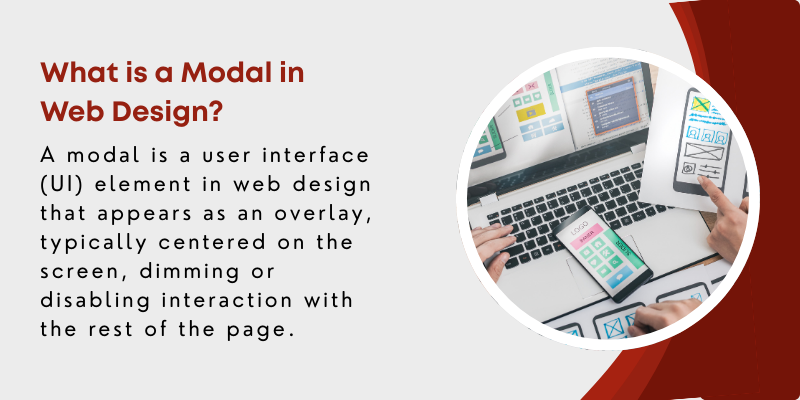
What is a Modal in Web Design?
A modal is a user interface (UI) element in web design that appears as an overlay, typically centered on the screen, dimming or disabling interaction with the rest of the page. It is used to display important content, such as forms, alerts, or additional details, that requires the user's immediate attention and which is also a fundamental component of effective UI Design that prioritizes focus and clarity.
Unlike a typical page, the modal creates a temporary disruption to the user’s experience, demanding their interaction before they can return to the main content.
Modals are designed to convey essential information or prompt the user to perform an action without navigating away from the current page.
Once the interaction is completed, the modal disappears, allowing the user to return to the original page seamlessly.
Common Scenarios for Using Modals in Web Design
Some of the common scenarios for using modals in web design include
- Used for quick login or sign-up without navigating away from the page.
- Displays important messages or warnings to capture user attention.
- Opens images or videos in a larger, immersive view without leaving the page.
- Confirms user intentions for sensitive actions like deleting or purchasing.
- Presents filtering criteria in e-commerce or search sites to refine results.
Check Our Web Design & Development Services!
What Are The Key Elements of Modal Design?
When designing modals in web design, several key elements work together to make sure they grab attention while still feeling easy and natural to use. A well-designed modal should look good, be simple to interact with, and remain accessible to all users, which is why professional design services often focus heavily on modal structure, usability, and consistency across devices. Additionally, leveraging Data & Analytics Services helps track modal performance, allowing designers to refine strategies and improve user interactions.
These elements generally fall into three main areas: visual design, user interaction, and accessibility.
1. Visual Design Considerations
Visual design plays a major role in how users perceive and interact with a modal. The goal is to make the modal noticeable without making it feel intrusive.
-
Size
The size of a modal should match its purpose. Full-screen modals may work well for images or videos, while smaller modals are better suited for forms, confirmations, or alerts.
-
Positioning
Most modals are placed in the center of the screen so users notice them instantly. This positioning naturally draws attention and feels familiar. In some cases, such as notifications or lightweight messages, modals may appear at the top or side of the screen.
No matter where they appear, the placement should feel intentional and should not block critical information.
-
Color
Color helps a modal stand out from the rest of the page. A common approach is to use a contrasting background for the modal while dimming the page behind it with a semi-transparent overlay.
This directs the user’s focus to the modal without breaking the visual consistency of the website. The color scheme should always align with the site’s branding for a cohesive look.
2. User Interaction
Some of the key factors of user interaction include
-
Close Buttons
A visible and easy-to-use close button is a must. It is usually displayed as an “X” in the top-right corner of the modal, where users expect to find it.
The button should be large enough to click easily, especially on mobile devices, to prevent accidental taps and frustration.
-
Exit Options
Beyond the close button, users should have multiple ways to exit a modal. Clicking outside the modal on the background overlay is a common and intuitive option.
Supporting the “Escape” key is also important, particularly for keyboard users. These exit options make modals feel flexible and user-friendly rather than restrictive.
3. Accessibility Features
Here are the two main key elements of accessibility features includes:
-
Keyboard Navigation
Modals should be fully usable with a keyboard. When a modal opens, focus should automatically move to the first interactive element inside it.
Users should be able to move through all elements using the “Tab” key, without focus escaping to the background page. Pressing the “Escape” key should close the modal and return focus to the element that opened it.
-
Screen Readers
For screen reader users, modals must be properly announced and structured. Using appropriate ARIA roles, such as role="dialog" or role="alert", helps screen readers identify the modal and explain its purpose.
When the modal appears, screen readers should announce its content and any interactive elements inside it. Users should also be able to close the modal easily using accessible controls or keyboard shortcuts.
Get Started with Our Design Services!
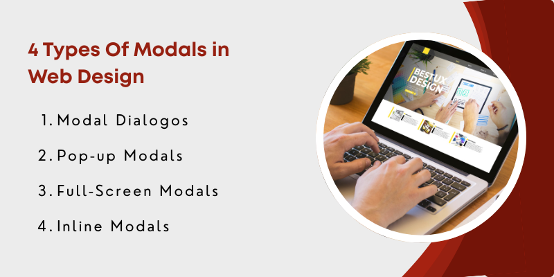
4 Types of Modals in Web Design
There are several types of modals commonly used in web design, each serving a different purpose and providing varying user experiences.
Here's a breakdown of the most popular modal types:
1. Modal Dialogos
Modal dialogs are the most traditional and widely used type of modal. They typically display a small window in the center of the screen, containing important information, forms, or prompts that require user interaction.
Modal dialogs are often used for confirmation messages, alerts, or any content that needs to interrupt the user's workflow temporarily.
This type of modal disables interaction with the background content until the user responds to the modal (e.g., by closing it or clicking a button inside it).
2. Popup Modals
Popup modals are similar to modal dialogs but are often triggered by specific user actions, such as clicking a button or hovering over an element.
These modals can be smaller in size and are typically used for displaying additional information, offers, or tips without completely obstructing the user's view of the page.
While they serve a similar purpose to modal dialogs, popup modals are generally more lightweight and can be more easily dismissed. They are commonly used for displaying short messages, promotional offers, or simple notifications.
3. Full-Screen Modals
Full-screen modals take up the entire viewport, typically covering the entire screen with an immersive experience. These modals are used when the content needs to take full focus, such as for video playback, image galleries, or complex forms.
The goal is to offer an uninterrupted user experience, where users can interact with large amounts of content without distractions.
Full-screen modals are often used in scenarios where the content is too large to fit into a smaller window or when the information being displayed requires the user’s full attention.

4. Inline Modals
Inline modals are a more subtle form of modals that are displayed within the flow of the page rather than as an overlay on top of the content.
These are often used to show content like additional details, product descriptions, or FAQs that complement the main content but do not require the full-screen interruption of a traditional modal.
Inline modals can be a great option for showing secondary information without completely breaking the user's focus or requiring them to interact with a new window. They can be revealed and hidden dynamically as part of the content flow.
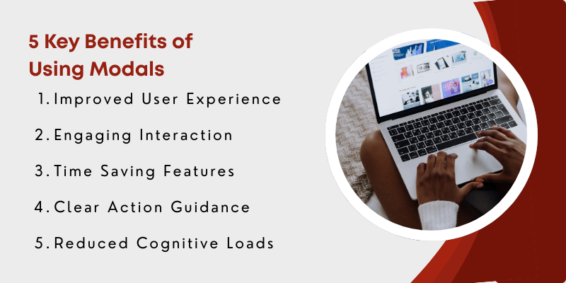
Top 5 Benefits of Using Modals
Modals, when used correctly, can significantly enhance the user experience on a website or application. They provide various benefits that help improve both user interaction and overall site functionality.
Some of the key benefits of using modals include:
1. Improved User Experience
Modals create a focused environment by presenting essential information or actions in an overlay, preventing page reloads and allowing users to complete tasks efficiently without leaving the current page. This results in a more streamlined and quicker user experience.
2. Engaging Interactions
By placing critical content in the foreground, modals capture attention and prompt users to interact. This visibility drives engagement, encouraging actions like clicking CTAs, filling forms, or confirming decisions, making the website more dynamic and interactive.
3. Time-Saving Features
Modals reduce navigation time by enabling users to quickly sign in, fill out forms, or access information like FAQs and filters, all without leaving the page. This efficiency enhances overall satisfaction and allows users to accomplish tasks faster.
4. Clear Action Guidance
Modals help direct users’ attention toward key tasks or information, ensuring they don’t miss important prompts, updates, or offers. This clarity can improve conversion rates and user engagement.
5. Reduced Cognitive Load
By providing immediate, context-specific information in modals, users don’t need to search through pages or menus, making interactions simpler and less overwhelming, especially for complex tasks.
 Download PDF Now
9 Best Practices for Using Modals in Web Design
Using modals effectively in web design involves a combination of accessibility considerations, proper triggering methods, and responsive design practices.
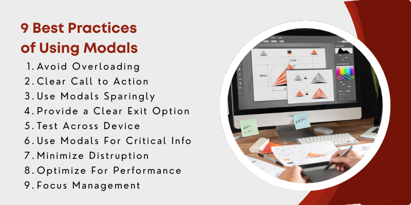
Following best practices ensures that modals enhance user experience while maintaining usability and inclusivity.
- Avoid Overloading with Information: Keep modal content concise and to the point to prevent overwhelming users.
- Clear Call-to-Action (CTA): Ensure modals have a clear and easy-to-understand CTA that guides users to the next step.
- Use Modals Sparingly: Avoid excessive use of modals to prevent disrupting the user experience.
- Provide Clear Exit Options: Always include a visible close button and support for dismissing the modal through other actions like clicking outside it.
- Test Across Devices: Ensure modals are tested on multiple devices to guarantee responsiveness and usability.
- Use Modals for Critical Information: Only display modals for important content that requires immediate user action or attention.
- Minimize Disruption: Use non-intrusive methods (e.g., slide-ins) for less urgent content to prevent interrupting the user's flow.
- Optimize for Performance: Make sure modals don’t slow down the page by minimizing animations and loading content dynamically.
- Focus Management: Always move focus to the modal when it opens and return it to the appropriate element when it closes.
7 Common Mistakes to Avoid with Modals
When designing and implementing modals, it's important to be mindful of certain pitfalls that can negatively impact user experience.
Here are some common mistakes to avoid:
- Modals should be responsive, with readable text and easy-to-click buttons on smaller screens.
- Modals should match the website's overall design in terms of colors, fonts, and button styles for a cohesive experience.
- Focus should shift to the modal when opened and return to the previous content once closed, especially for keyboard and screen reader users.
- Modals should be relevant to the user's actions to avoid confusion or disruption.
- Modals must explain next steps clearly to avoid user confusion or hesitation.
- Modals with forms or user input should display clear error messages to guide users on how to fix mistakes.
- Animations should be simple and fast to prevent delays in user interaction.
What Are The Trends and the Future of Modals
Modals in web design are evolving with new trends that focus on enhancing user interaction and experience. As the digital landscape changes, modals are becoming more dynamic, minimalist, and user-centric.
One major trend is the integration of animations. Instead of appearing suddenly, modals now feature smooth transitions such as fading or sliding in and out, making them more engaging and visually appealing.
Another trend is the rise of minimalistic modals, which prioritize simplicity and clarity. These modals focus on delivering essential content without unnecessary visual elements, offering a clean and intuitive user experience.
As user experience design continues to evolve, modals are becoming more adaptive and context-aware. They're no longer just pop-ups; they’re designed to enhance the user’s workflow by appearing only when necessary and adding value.
Improvements in accessibility and focus management also ensure that modals cater to a broader range of users, including those with disabilities.
Predictions for the future of modals include smarter, more personalized interactions. Modals may be triggered based on user behavior, providing tailored content or actions.
Additionally, the integration of interactive elements, such as chatbots or live customer support, will make modals even more engaging and helpful.
Frequently Asked Questions (FAQs)
What Is A Modal In Web Design?
A modal is a UI element that appears as an overlay on top of the main content, requiring user interaction before they can return to the page. It is commonly used for displaying alerts, forms, or additional information.
When Should I Use A Modal In Web Design?
Modals should be used when you need to capture the user's attention for important content, such as notifications, confirmations, or quick forms, without navigating away from the current page.
Are Modals Accessible?
Modals can be made accessible with proper design, including focus management, keyboard navigation, and screen reader support. Ensure modals are usable for all users, including those with disabilities.
How Do I Close A Modal?
Modals typically have a close button, often represented by an "X," but can also be closed by clicking outside the modal or pressing the "Escape" key, providing multiple exit options for users.
Can Modals Be Responsive?
Yes, modals can be designed to be responsive. They should adapt to different screen sizes and orientations, ensuring usability on both desktop and mobile devices. This responsiveness is especially important for platforms offering Mobile App Development Services, where modals must function seamlessly across various devices and touch interactions.
How Can I Optimize Modals For Performance?
To optimize modals for performance, consider lazy loading content, minimizing complex animations, and reducing the number of active event listeners. Ensure modals don’t affect page load times negatively.
What Are The Common Mistakes To Avoid With Modals?
Common mistakes include overusing modals, failing to provide clear exit options, not considering accessibility, and not making them mobile-friendly. It's important to use modals thoughtfully and sparingly.
Conclusion
Now you have a clear understanding of what a modal in web design is. Let's conclude. A modal is an essential UI component that enhances user interaction by providing focused, actionable content without disrupting the overall experience. The key benefits of using modals include improving user experience, increasing engagement, and saving time by allowing users to interact with important information without navigating away from the page. By following best practices such as ensuring accessibility, using minimalistic designs, and triggering modals, thoughtfully principles commonly applied by digital transformation agencies like Centric designers can create seamless and effective modal experiences.
As modals continue to evolve with trends like animations and personalized interactions, they will play an increasingly important role in user-centered web design. When implementing modals in your web projects, be sure to use them purposefully and thoughtfully. They should always serve a clear user need, enhance the user experience, and be used in moderation to avoid overwhelming users.


